Case study - BT Business
Help homepage
Working directly with BT & EE Business via EPAM Systems, I was integrated into the SME Help & Support squad as the sole experience designer for a digital transformation project. Promoting a digital first approach aiming to reduce calls and call waiting times for BT & EE business customers. Working across both brands I redesigned both help home landing pages and contact us sections also looking at areas such as complaints and BT help category pages. On the EE side; working with the UR I was involved with research such as agent interviews, card sorting & for BT help home user testing.
Research | Wireframing | Prototyping | User testing | UI Design
The problem in brief
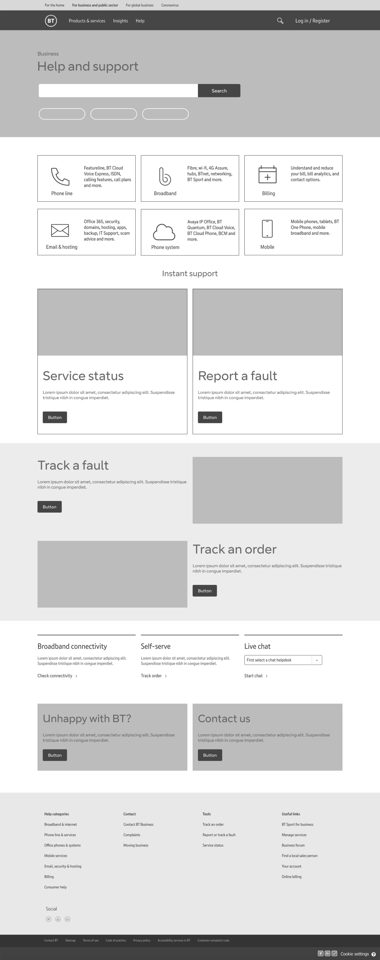
Here we’ll look at the BT Business home page redesign as an example. BT business would like to bring in new branding & promote a digital first approach in order to cut cost and call waiting times for its self and customers. Original old page design shown to the right.
Actions: Work with the squad being a PO, copy writer, content author, relevant developers & the wider team of designers to create a new help home landing page for the business. Initially looking into how the present page was performing by analysing the analytics to make informed design decisions from the outset.
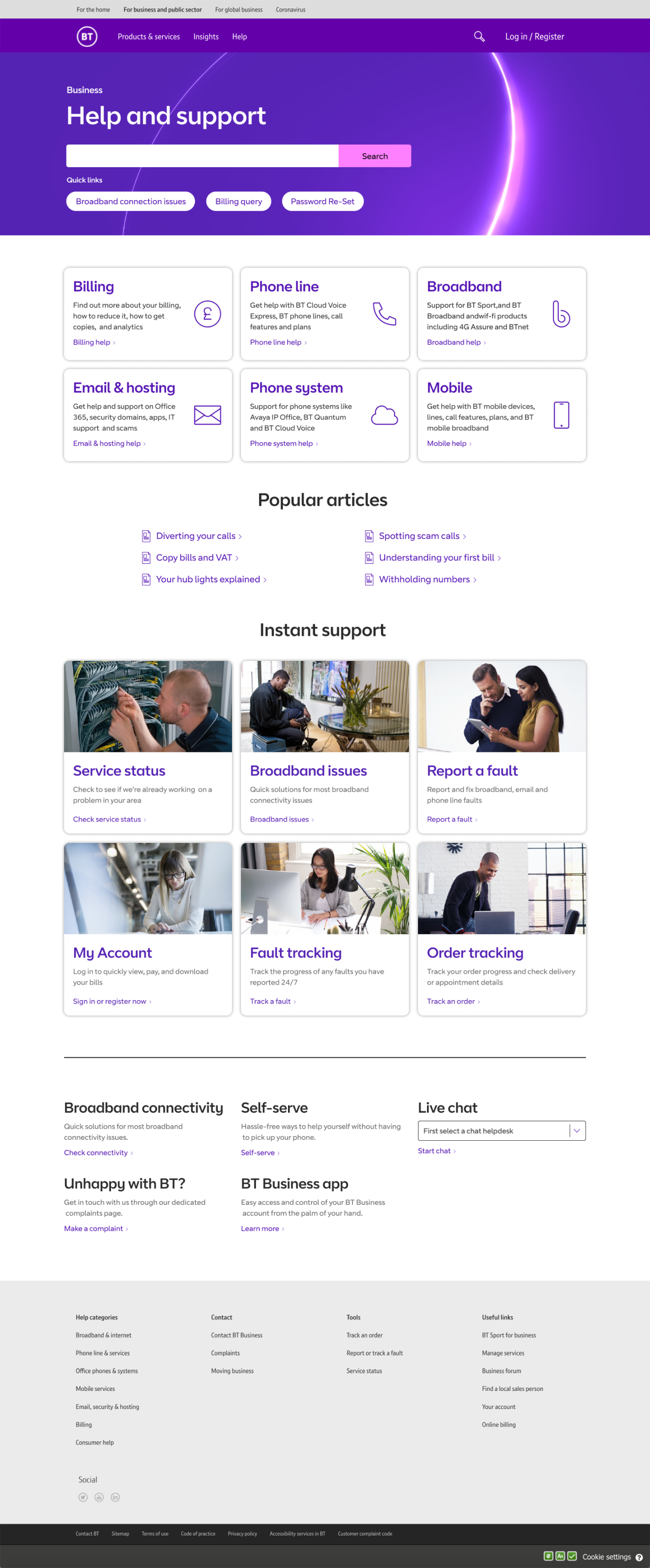
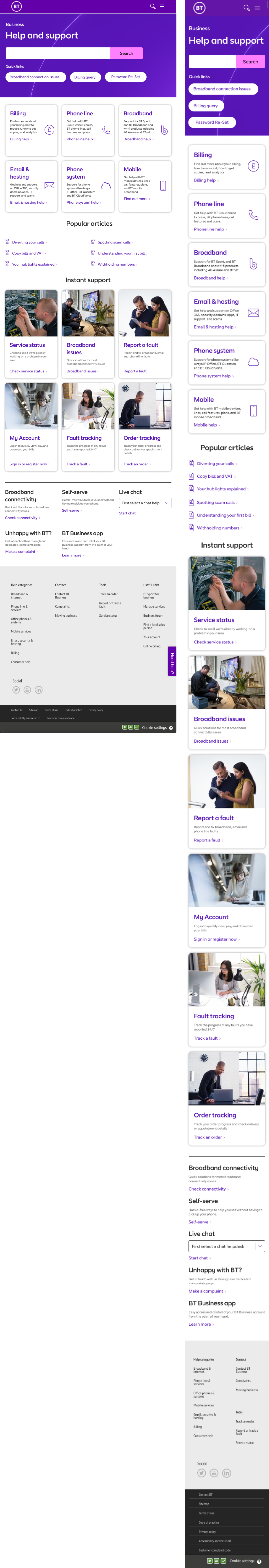
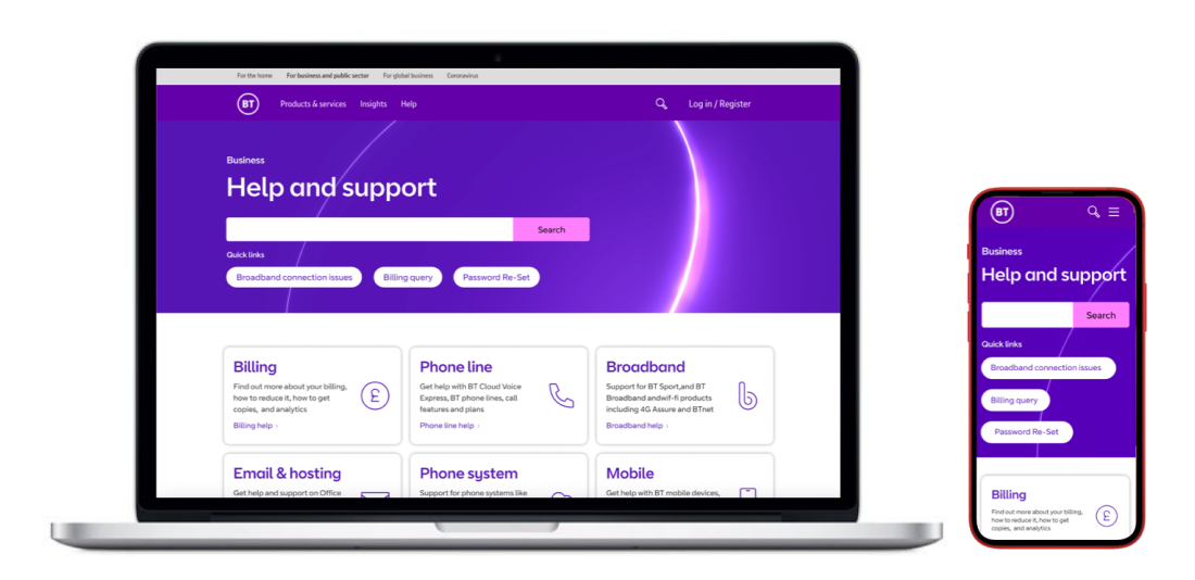
The solution
After looking into how the present page was performing by analysing the analytics, using Adobe analytics... We decided that a lot of old CTA’s were redundant & could be removed & in order to help the user find there answers faster to move the main CTA’s above the fold. Using the results to in effect order the page content in terms of hierarchy given click counts over time.
Working with the PO, a user researcher to carryout user testing & the lead UI designer in order to contribute to the new design system, we effectively took the new page design from initial wireframes to polished UI, then handed over to dev & put live.
View desktop pdf